
Our brains play a lot of helpful tricks on us. For example, when we see a number of objects in motion, we tend to project that motion onto other nearby objects as well. In animation theory this is referred to as misdirection. We see the additional motion because it is suggested by other motion happening around it, not because it actually happened. Tricky!
So why care about this misdirection stuff? Because it can save us some work while making things look a bit more interesting. We can write fewer transitions and make it look like there's more than that going on than there really is. Not a bad deal, really. Also, it's nice to mix things up. Applying the same transition verbatim to all the elements we're working with gets boring really fast.
So why care about this misdirection stuff? Because it can save us some work while making things look a bit more interesting. We can write fewer transitions and make it look like there's more than that going on than there really is. Not a bad deal, really. Also, it's nice to mix things up. Applying the same transition verbatim to all the elements we're working with gets boring really fast.
Our starting point
Let's build a little something to show what I'm talking about. And let's make sure it includes kittens.
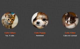
Our example is a list of items that we'd like to dress up with some transitions. It's a common type of content to be dealing with, but our list happens to be a list of tiny pets which may be a little less common. Each item in the list has a photo, title and short caption. Combined they'll, transition on :hover to change colour and scale up the image just slightly, like so:http://www.netmagazine.com/files/tutorials/demos/2012/06/more-efficient-css3-transitions/demo/demo.html.
We'll start with each looking like this:

Let's get transitioning!
- .pet {
- width:200px;
- padding:2em 1em 1em 1em;
- text-align: center;
- -webkit-transition: all 300ms ease-out;
- -moz-transition: all 300ms ease-out;
- -ms-transition: all 300ms ease-out;
- -o-transition: all 300ms ease-out;
- transition: all 300ms ease-out;
- }
- .pet img {
- margin:auto;
- display:block;
- -webkit-transform: scale(.9);
- -moz-transform: scale(.9);
- -ms-transform: scale(.9);
- -o-transform: scale(.9));
- transform: scale(.9);
- -webkit-transition: all 400ms cubic-bezier(0.250, 0.460, 0.450, 0.940);
- -moz-transition: all 400ms cubic-bezier(0.250, 0.460, 0.450, 0.940);
- -ms-transition: all 400ms cubic-bezier(0.250, 0.460, 0.450, 0.940);
- -o-transition: all 400ms cubic-bezier(0.250, 0.460, 0.450, 0.940);
- transition: all 400ms cubic-bezier(0.250, 0.460, 0.450, 0.940); /* easeOutQuad */
- }
The :hover state
Shortly after that, just like you'd expect, we'll define what should happen on :hover in our CSS like so:
- .pet:hover {
- background-color:white;
- background-color: rgba(200,200,200,.3);
- -webkit-border-radius: 10px;
- border-radius: 10px;
- cursor: pointer;
- }
- .pet:hover img {
- -moz-transform: scale(1);
- -webkit-transform: scale(1);
- -o-transform: scale(1));
- -ms-transform: scale(1);
- transform: scale(1);
- }
- .pet:hover h2 {
- color:#c9a833;
- }
We've only defined transitions for two of our elements, but as you can see above, we're changing properties for three of them on :hover. When you first viewed the demo, you probably noticed the colour change on each item's title in addition to the background colour and image scaling. However, you might not have noticed that there was no actual CSS transition applied to it.
With the soft transition of the background colour behind it and the image scaling above it, your eyes want to see that the text transitioned smoothly as well even though it was really just a hard cut to the new colour. In this situation it appears to move with the group to its hover state.
Of course, now that I've called your attention to it, or if your eagle eyes inferred a bit from the article's title, you were looking for it and the effect is lessened. But to the casual viewer, there's no difference, and you've just written one less transition than appears to be there. Not to mention made the overall motion of the group more varied and interesting.
And the moral of our story
When you mix elements that have a true transitions defined and those that just change with a hard cut to their new state you can get more interesting effects with fewer transitions written out. It's more of an art than a science, but we can pretty easily create situations where what appears to be going on visually is much more complicated than what we've actually coded behind the scenes.
No comments:
Post a Comment